When decorating a home, there are endless color palettes and décor themes you can choose from. In recent times, one of the most popular color themes has been using a neutral palette. However, decorating with a neutral palette isn’t as easy as it seems; a small mistake can ruin your look completely.
Whereas, when you use a neutral color palette correctly, you can transform any space instantly. From warm pastel shades to cool shades of gray, a neutral palette not only makes your space aesthetic but also gives it a stylish and posh appearance. To help you choose the right tones of neutral shades, Argan Design has compiled this article.
Subtle Neutral Shades Look Great
When you decide to use a neutral color scheme, that doesn’t mean you will have to stick to just one particular shade and use it everywhere. It also doesn’t limit the range of shades that you can use.
You can combine different shades of gray, white, cream, and any other shades from the warm neutral color palette; just make sure that the shades you choose go well together and blend. Gray has become one of the hottest and most on-trend neutral shades this season. Choosing different shades of gray and matching them with whites and creams can also give your space an uplifting look. Gray offers one major advantage over other neutral shades, and that is that you can combine both warm and cool tones very well using gray. When you combine different shades of one color, it is called a tone-on-tone style, and it looks very classy and rarely goes out of style.
Go For Romantic Neutrals
When we say the word ‘romantic neutral’, people start assuming these are feminine colors, but pink is one of the best neutral paint colors. You can never go wrong with a neutral pink paint color. When a neutral pink shade is used correctly, it brings life to a space. If you think painting an entire wall in blush pink is a bold step for you, you can use a throw, a cushion, or even coasters for your coffee table in the color.
Using Pearl White Paint Colors
When talking about neutrals, white is often the first shade that comes to people’s minds. But people get rid of white as an option equally fast, assuming white is dull. In reality, white isn’t just white; it comes in as many varieties of shades and options as its colorful counterparts. The list of things you can do with white is limitless and can get long when you work with experienced design firms such as Argan Design.
At Argan Design, we believe that using white paint on walls opens up a multitude of opportunities for décor options in a room and lets one highlight furniture and any other prominent feature.
Make Use Of Neutral Colors With A Twist
To incorporate neutral shades in your décor, you don’t need to paint the walls; you can use neutral shades in multiple ways. Many warm neutral paint colors look great on rugs and couches. Combining silver, charcoal gray, and white with misty mauve adds a touch of elegance and luxury to any space. You can even choose to amplify the space using accents of gold, silver, or teal.
Use Contrasting Neutral Shades
Using contrasting shades from warm neutral color palettes together is like a hand fitting into a glove. Classic examples of contrasting neutrals are black and white. Argan Design used a black-and-white color palette in a recent kitchen design in Roseville, where the walls were painted white and all the cabinets were chosen in striking black shades. To bring a balance between the two and add a touch of elegance; the tiles used a good mix of black and white. To take the look to the next level, use gold or silver accents in strategic places.
Use Dark Neutral Colors
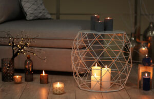
Using dark neutral colors in any space gives it a cozy, cocoon-like effect. But make sure you do it the right way, or you run a higher risk of making the cocoon look like a cave. The trick to avoid making the space look overwhelming, include a light shade in your design. A warm white or cream bed throw or cushions, as well as a large painting with warm shades that complement and contrast the dark shades on the walls, can be refreshing.
Use Neutrals as Supporting Colors
If you don’t want to create a completely neutral look in your space you can use neutral shades as supporting colors. When you opt for certain color themes, there are times when to increase the sophistication of the space, you need to tone down the colors. Dark neutral colors, such as pewter gray, calm and balance the space. Whereas if you use white as a supporting color, it energizes any color palette, and black strengthens the space. Using gold accessories with white walls brings out a sharp look.
Use Textures With Neutrals
Using different textures becomes a key element when you want to bring out the best in your neutral décor. Mix your furnishings with different materials and textures to keep the overall look interesting. Using leather, wood, metal, and upholstery along with a neutral color palette make the space look very sophisticated and modern.
Choose the Best Neutrals for Your Room
Before you choose a shade for your room, consider its location and various other factors such as size, natural lighting, and the use of the room or space. A living room will look good with bright natural colors, while a bedroom can look good with dark neutral colors.
Natural lighting is another factor to consider when selecting the right neutral shade. If your room has ample sunlight, go with darker shades of white and ivory. If there is a lack of natural light in the room, choose brighter and lighter shades of neutral paint.
Using different shades of color affects the feel and mood of a room. So, decide how you want the overall look to appear. Still confuse about choosing the right color for your rooms. Contact Argan Design for professional interior design service in Roseville and surrounding areas.